The need
Why the fresh coat of paint on Housing.com?
Housing.com is India's top real estate platform and was acquired by a global giant REA Group. With a high reputation in the market, they needed an innovative careers website to attract top talent as the current one was not living up to the standard.
process
Blueprint to Success
The project involved four main categories: research, UX, UI and coordination with the developers.
Research
  • Understanding the brand
  • Secondary research
  • Benchmarking
  • Competitor analysis
  • Interviews
  • Inspiration collection

Design
  • Ideation
  • Information Architecture
  • Low fidelity wireframes
  • High fidelity wireframes
  • Iconography
  • Mobile version wireframes
  • Prototype
  • User Testing
Development
  • Defining the Interactions
  • Coordination with developers (front-end and back-end development)
  • Testing & Quality Assurance
  • Handoff

target users
Those Who Matter Most
Housing.com has a workforce predominantly aged between 24 to 40 and their biggest recruitment needs were in the sales department. Our goal was to create a straightforward design that was both innovative and user-friendly.
Current Status

What the page looks like right now

The current careers website of Housing.com is a very brief site that quickly touches upon its vision, mission, and values. It has very simple layouts and job seekers are redirected to the job board of Proptiger, Housing.com's sister company, which was not ideal.

Benchmarking

Setting the tone

Design-wise, I took Spotify as a benchmark and then further took the competitors of Housing.com. I also included REA Group as came under the aspirations of the client. This helped in setting the expectations for the client.
View benchmarking
Competitor analysis

Where to stand

User interviews

Learning from the users

To create the new careers website for Housing.com, I gathered insights from current employees and target users through interviews to better understand their needs and expectations.
What I asked the current employees:
  • When learning about a company for the first time, what helps you gain trust in it?
  • What attracted you to this company in the first place? Where did you find this information?
  • What are the top 3 things you look for when you are on a company’s career page?
  • How important is it for you to know the hiring process before you apply at a place?
Arpit Agrawal: Lead Product Manager at Housing.com
  • To gain trust in a company, he researches leadership, achievements, credentials, and stats.
  • Top 3 things on a career page: company info, stats, and education of leaders/mid-management.
  • Knowing the hiring process and the number of rounds helps manage expectations.
Mahima Jindal: Software developer at Housing.com
  • Joined Housing for its good work environment and culture.
  • Trust increased due to the company's placement in the market and a recommendation from a friend.
  • Attracted by work, culture, compensation packages, articles, and LinkedIn.
  • Hiring process is not important to her, but people often ask her about it.
What I asked to the target users:
  • Top 3 things checked in a job posting?
  • Issues faced while applying for a job?
  • Platform preference for job application?
  • Companies with a seamless hiring process?
  • What best showcases company culture on a careers page?
  • Factors for a simple and efficient job application process?
  • Best feature you experienced on a job platform?
Sathya: 3D Designer
  • He checks for software knowledge, experience required, and company culture in a job posting.
  • He does not like hyperlinks in LinkedIn but loves the easy-apply feature.
  • Sathya uses Behance to apply for jobs.
  • He was impressed with the career website experience of Ather.
  • One of the best features he has come across is where all the details get auto filled in after uploading the resume.
Pratik: Senior Relationship Manager
  • Top things Pratik checks for in a job posting: job description, requirements, and benefits.
  • Pratik faces issues with lengthy or complicated application processes.
  • He uses LinkedIn for job search and networking.
  • He would like to see more information about a company's mission, values, diversity and inclusion efforts, and opportunities for career growth and development on their careers page.
  • A job application should allow applicants to save and edit their information.
  • Pratik loves the feature of saving job searches and receiving regular notifications about new job openings that match his criteria.
Gaurav Mehta: Growth Advisor
  • The top 3 things he checks for in a job posting are company headcount growth, quality of people, space the company is in.
  • JD must be precise, with proper clarity and template.
  • Issues he faces: needs to go through 3-4 interviews to get comfortable with the people.
  • Applies through LinkedIn, researches company, checks website, and re-checks LinkedIn after getting a callback.
  • The company should proactively highlight culture and stats.
  • Information should be crystal clear, including growth path, the opportunity to interact with multiple stakeholders, and their communication style.
  • Used a lot of IIM Jobs.
Ideation Process

Building the Bridge Between Job Seekers & Housing.com

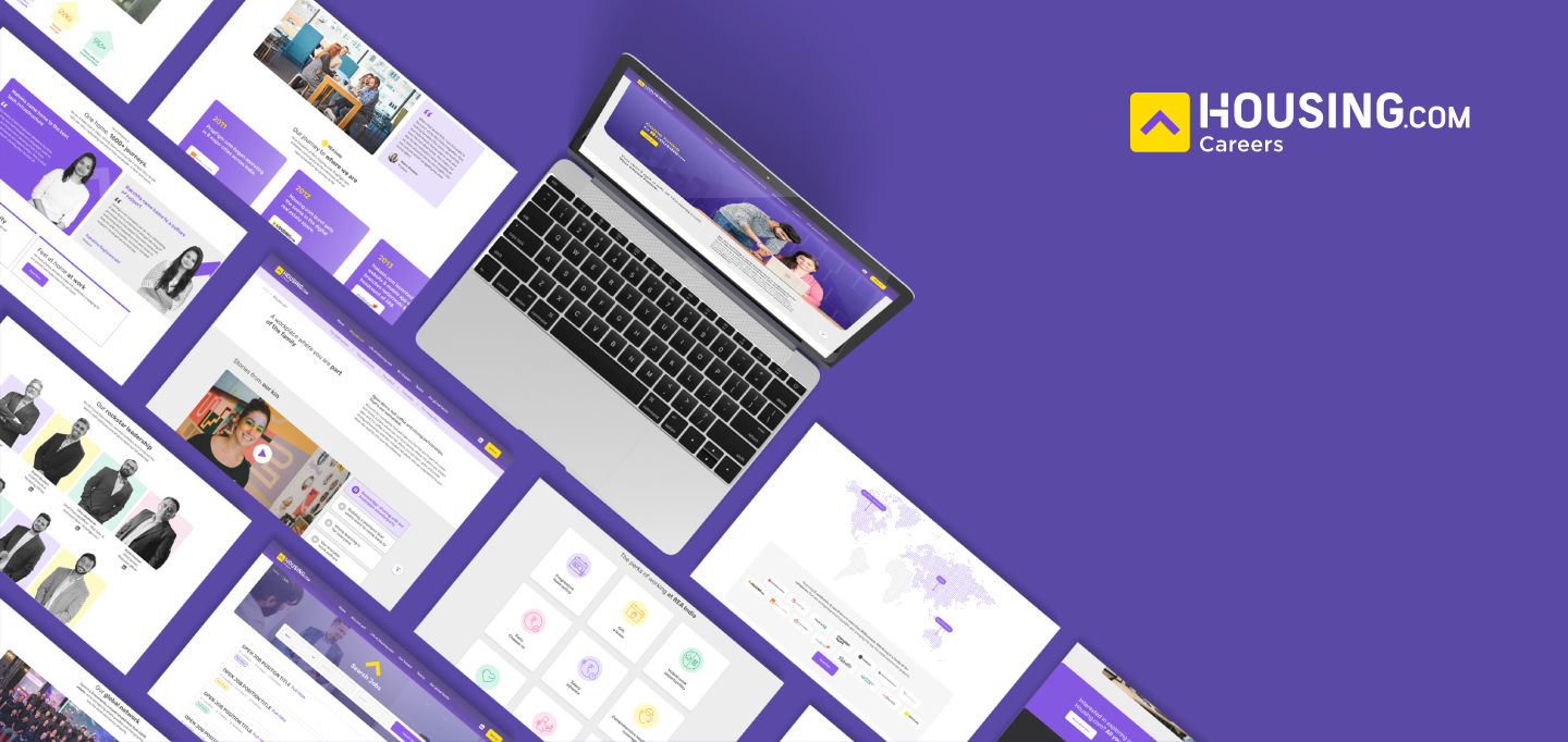
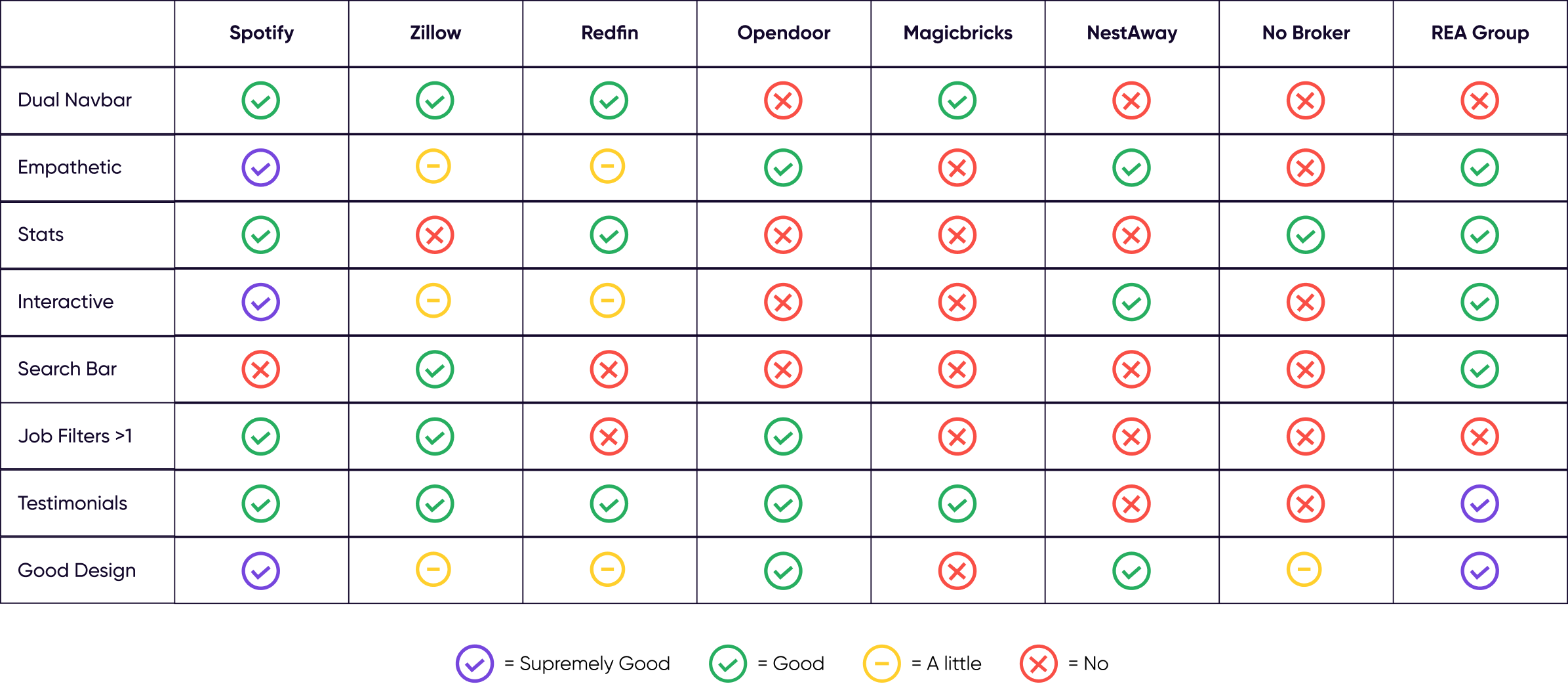
  • I first made a list of all the website features and information sections I could think of with the target audience in mind.

  • Next, I bounced ideas with my mentor and the content team to determine their feasibility

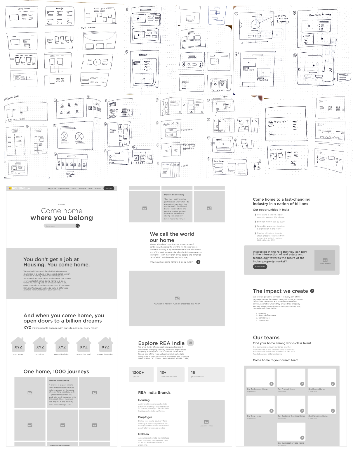
  • We then had a basic idea of what the website should hold and the content creation started.

Information Architecture

Building the foundation

The design process with the client

Designing with the highs, lows, and everything in between

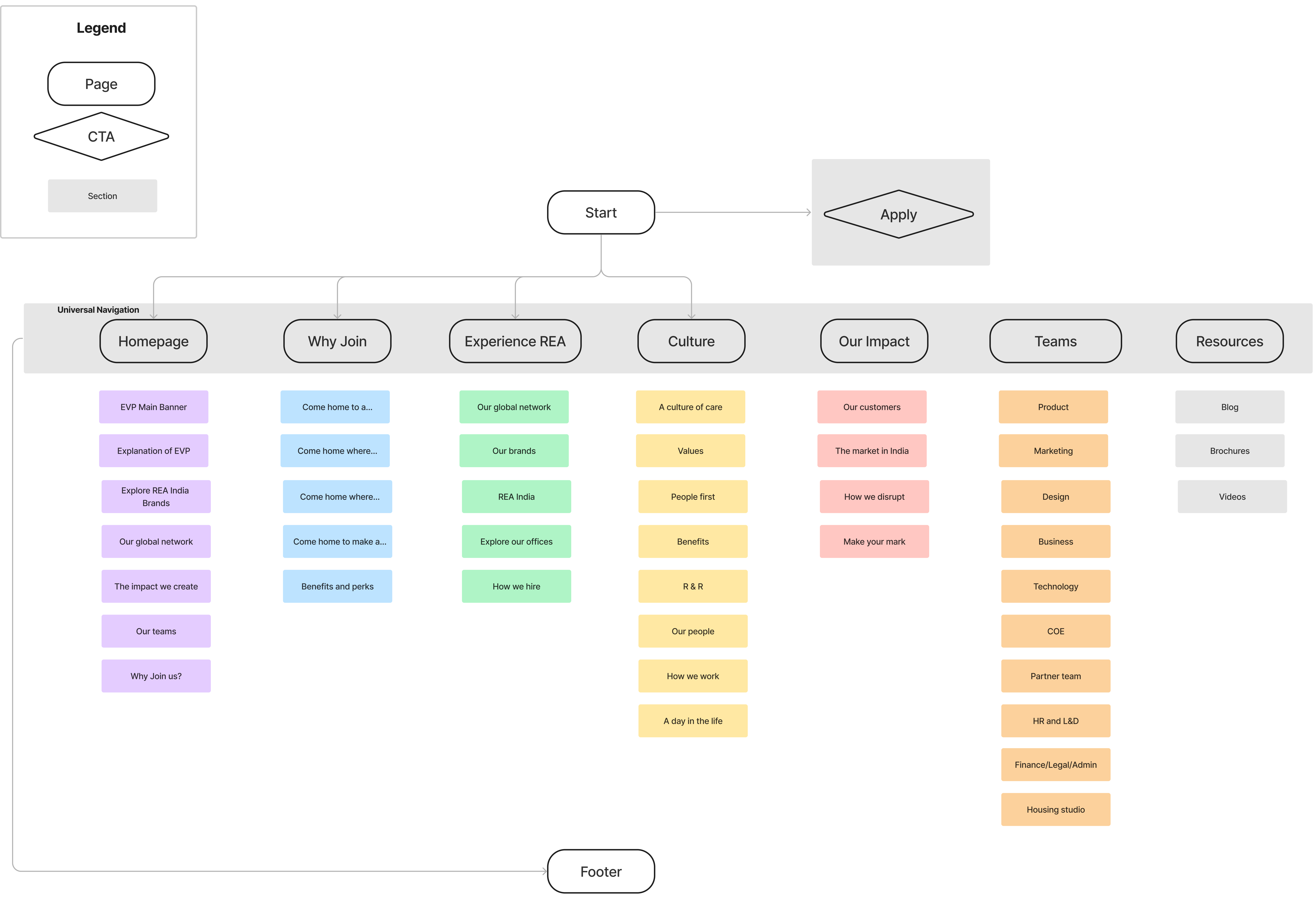
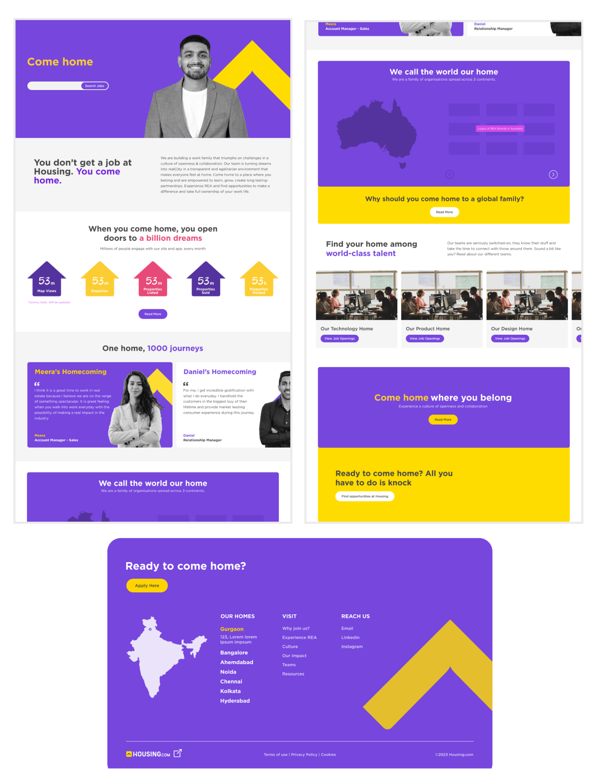
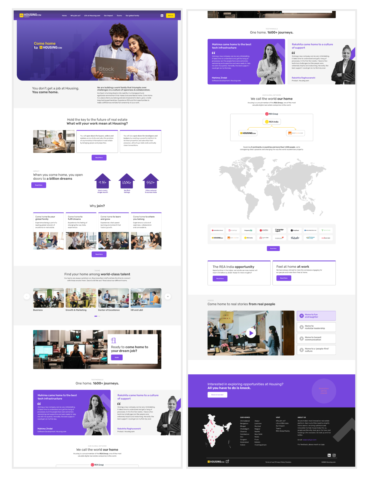
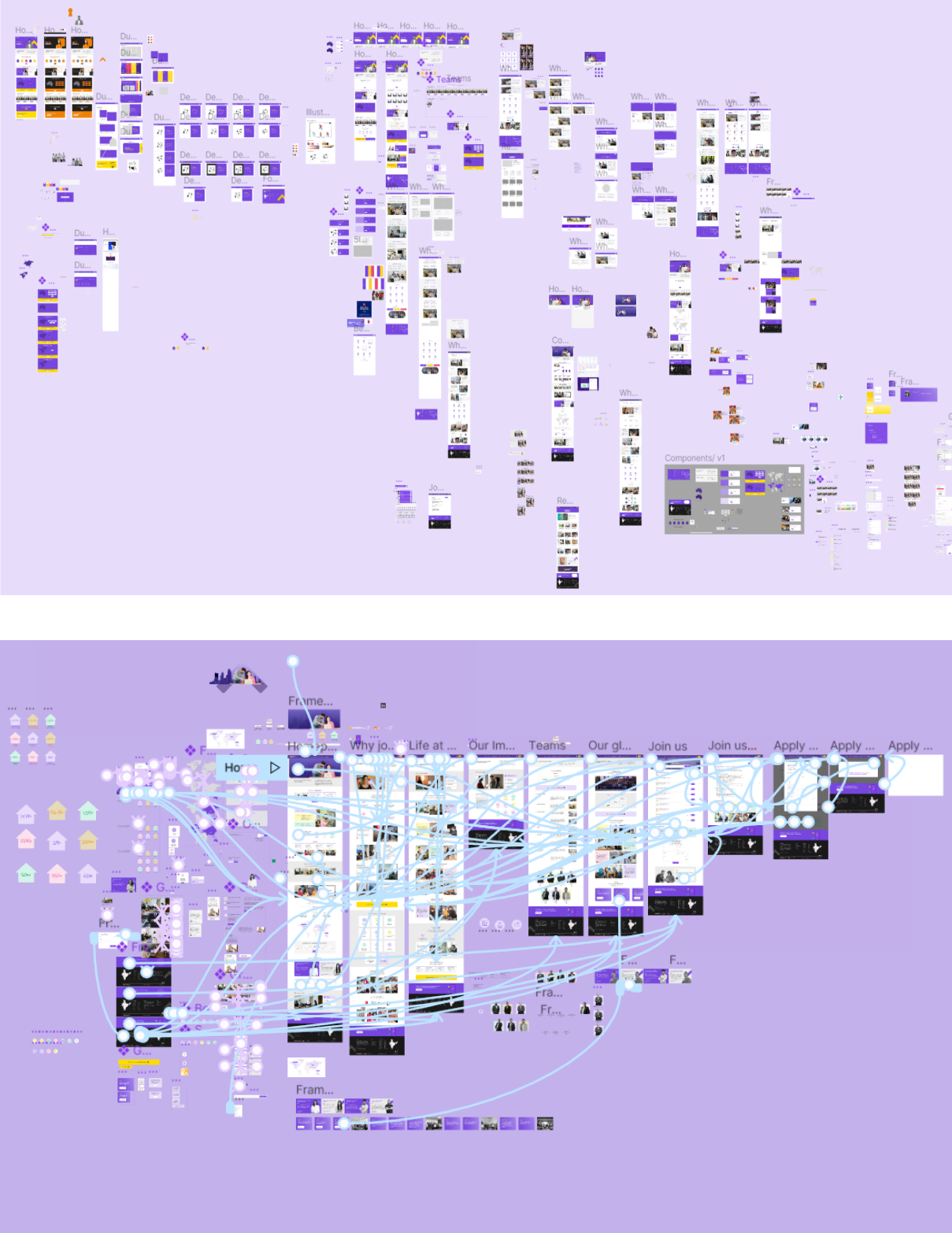
This is roughly how we reached to getting the design approved

Low Fidelity: Homepage

  • Packed with motivation and learning I began the low-fidelity version of the home page.
  • Realized that the frame dimensions I am using will be hard for the developer to convert.
  • I also used the guides wrong, after rectifying I came up with the low fi wireframe for the homepage.

High Fidelity: Homepage

  • Converted the wireframe into high fidelity but it was not working out. After some iterations, finalized it and showed it to the client.
  • They liked it but they felt it was very animated. My mentor suggested toning down the colours.

High fidelity homepage with web guidelines

  • The client was more positive towards it, they then shared the web guidelines that had to be followed.
  • Implemented them, and the client liked the Homepage.

High Fidelity: Other pages

  • Moved on to the other pages and started with low fidelity and then converted the selected options into high fidelity.
  • Continuously worked with the content team for sometimes the content to work around the design and sometimes the design to work around the content.

Icons and illustration

  • Collaborated with Adithya, an illustrator for the icons and illustration. We tried a couple of styles and finally selected the one that matched best for Housing.com

Go ahead!

  • The client liked where the design was heading
  • After multiple calls, content changes and iterations we were the owners of a proud prototype!
user testing

Gathering Feedback and Refining the Design

Being an important practice, I decided to conduct pre-development usability testing for the prototype among 8 employees of Housing.com for 30 min each in a remote setting. Here are the top learnings from the user testing which we addressed.

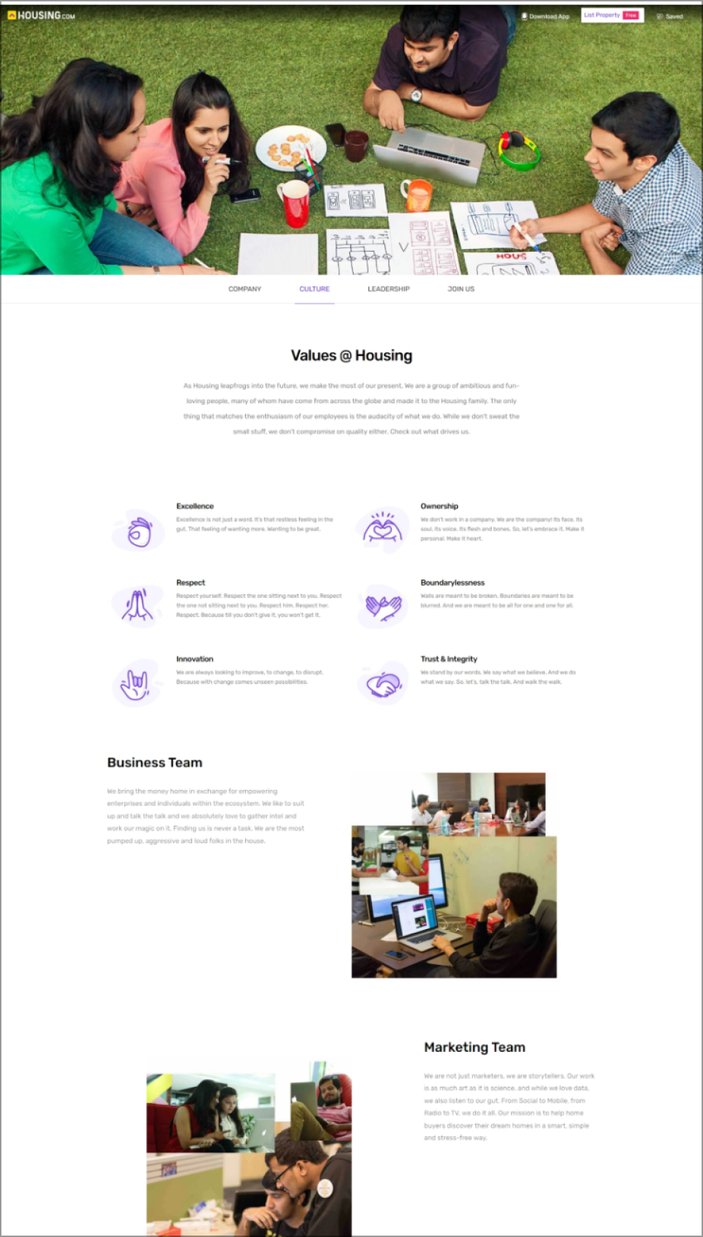
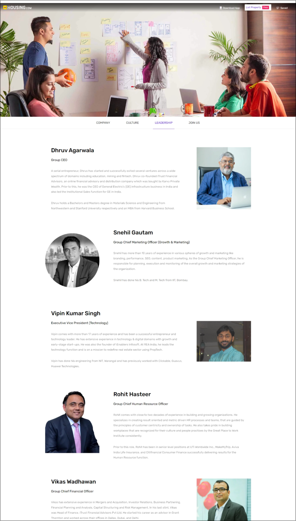
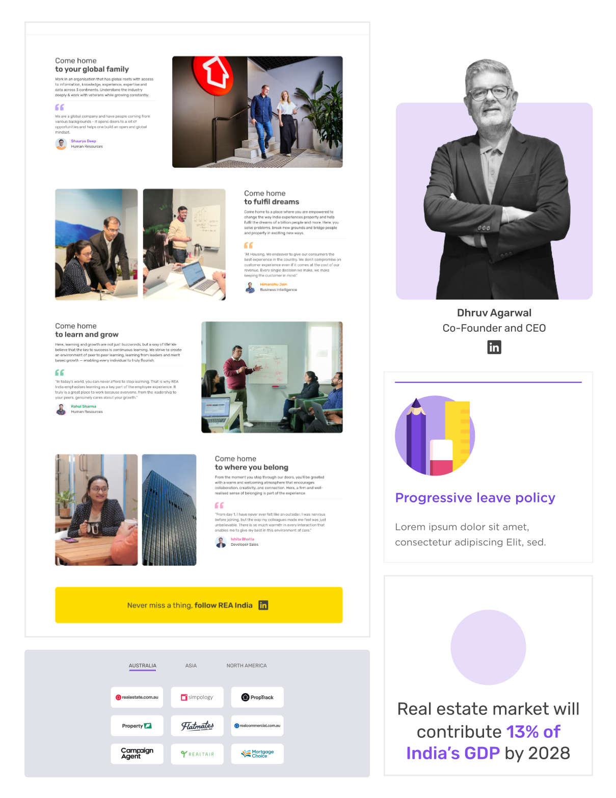
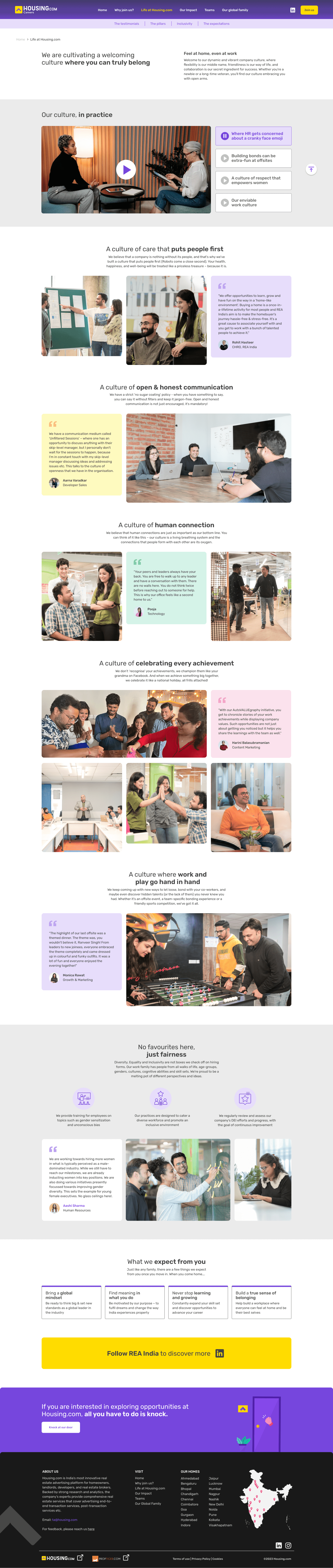
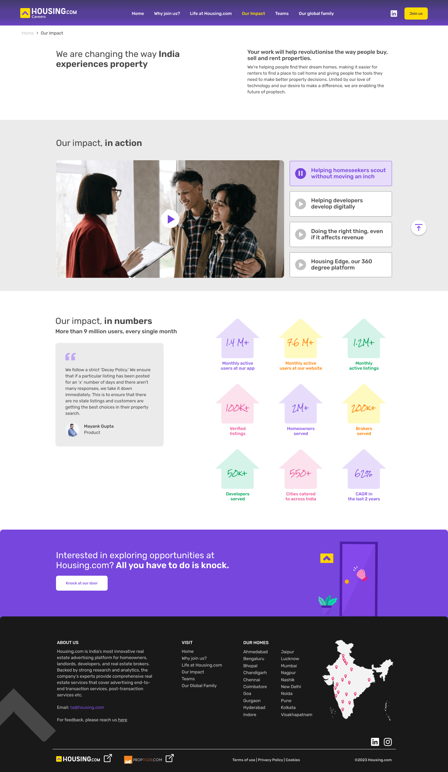
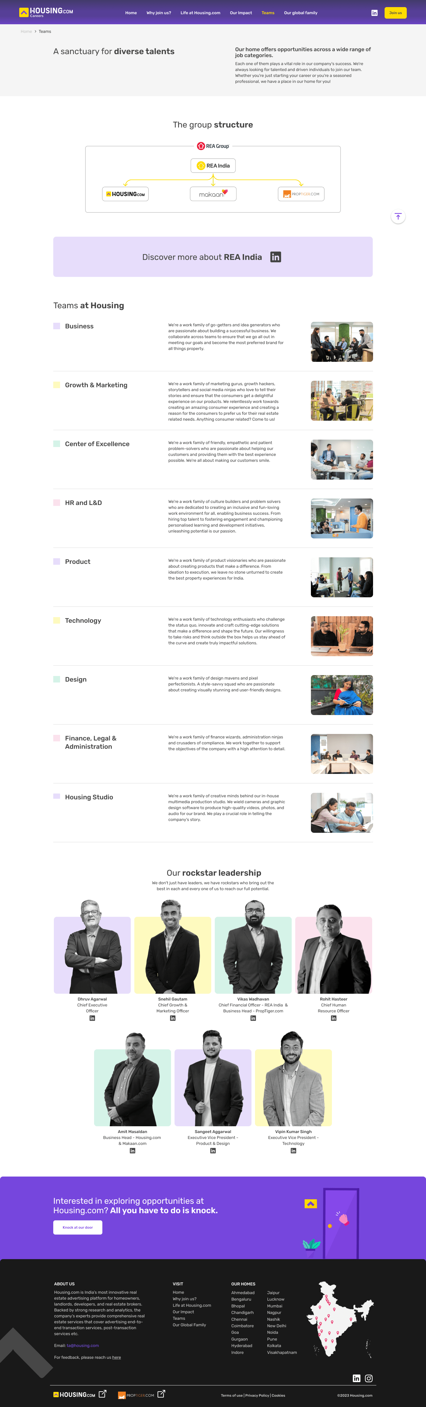
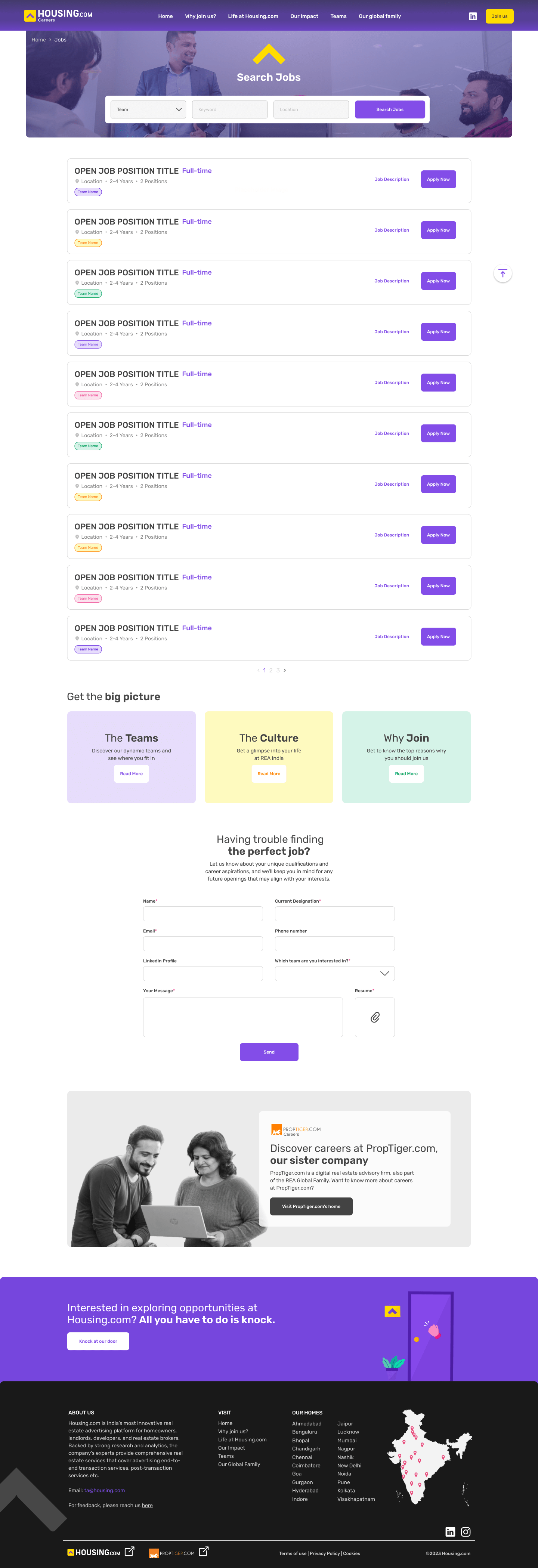
  • Users expected and wanted to learn about the top management in teams.

  • The navigation felt a little complicated to the users, especially on the why join page.

  • Users who have not seen the website before or know of Housing.com and REA might have trouble understanding what each is.

  • The main CTA button on the navbar received little attention and was thus overlooked.

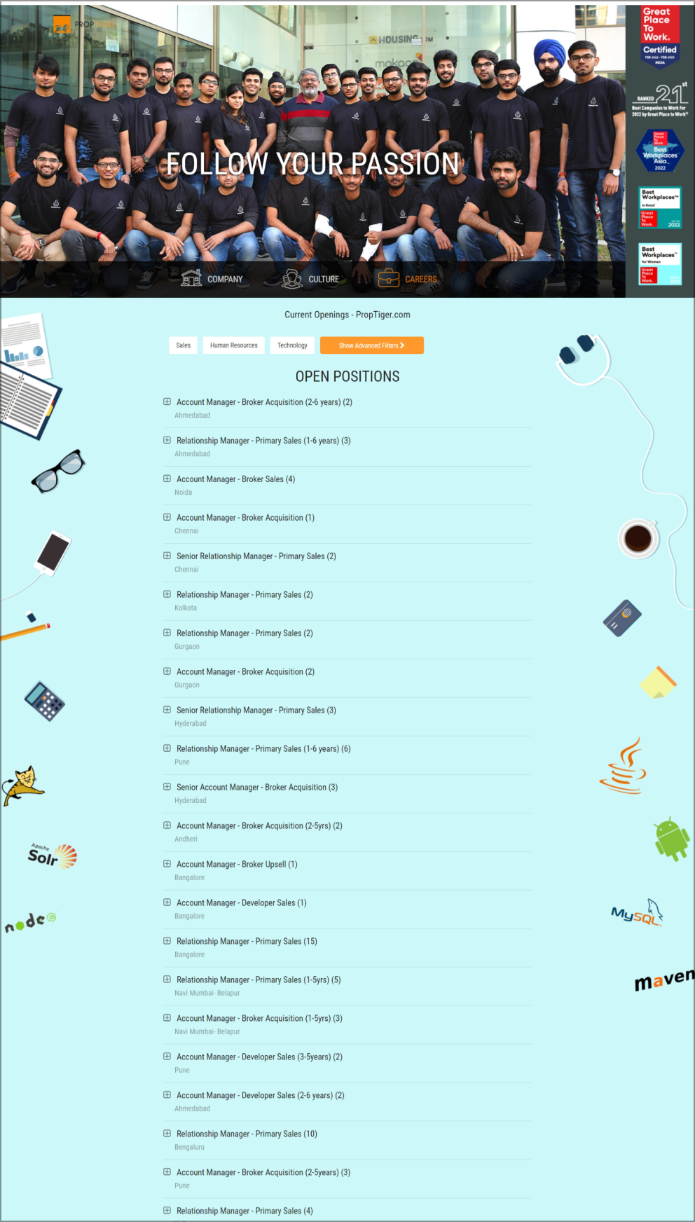
  • Filters of different teams on the job board will be helpful.

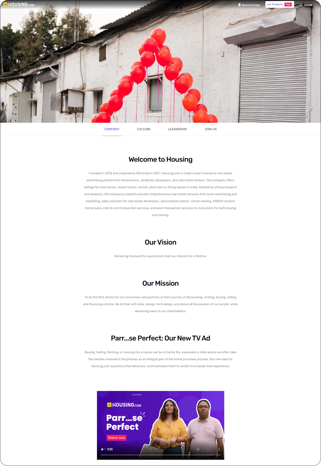
  • The user was looking for a clear vision and mission of Housing.com

Detailed report: Learn about the goals , questions and all the findings
Final designs

Presenting a user tested and approved: The Housing.com career website

The different pages designed on the website

Note: Please scroll down inside this laptop screen to view the screen further
⭐ View developed site here ⭐
mobile version

For the smaller screens

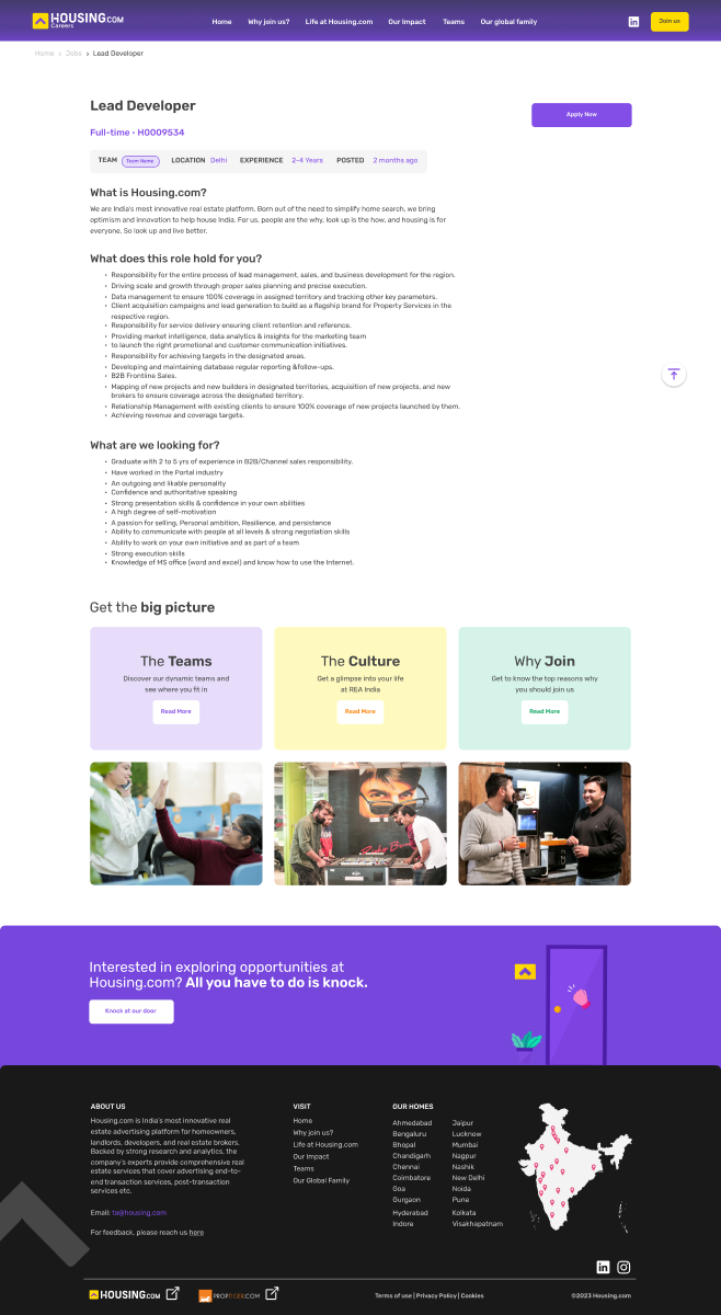
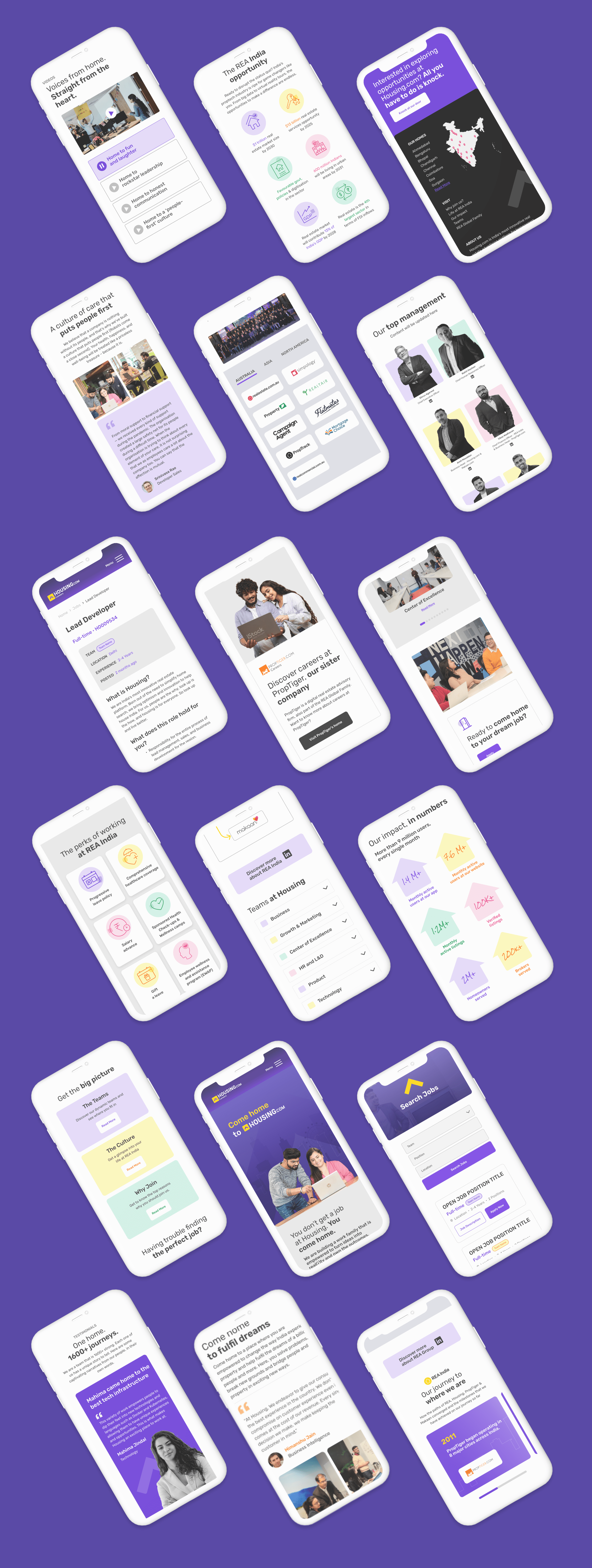
Since a large number of people apply from their mobile phones, it is important to make sure the website is responsive to the smaller screens.

learnings

When life gives you a brief, you give it your best

  • Collaboration is key: I've learned that working closely with clients, stakeholders, and other designers can lead to better outcomes than working alone. By sharing ideas and perspectives, we can create more comprehensive solutions that meet the needs of all involved.

  • Research is essential: Before starting any design project, I've learned that conducting thorough research is critical. By understanding the user's needs, preferences, and behaviors, I can create more effective designs that resonate with the target audience.

  • Testing leads to improvement: Through user testing, I've learned that even the best designs can be improved. By gathering feedback and insights from real users, I can make data-driven decisions that lead to better outcomes.

  • Embrace iteration: I've learned that iteration is a natural part of the design process. By embracing the feedback loop and being open to making changes, I can create designs that continuously improve and evolve over time

Thank you for checking this out! View my other projects here:

I'd love to hear from you!